entrance
area, m2
bathroms
bedrooms
rooms
parking
Terrace
floor
Truro
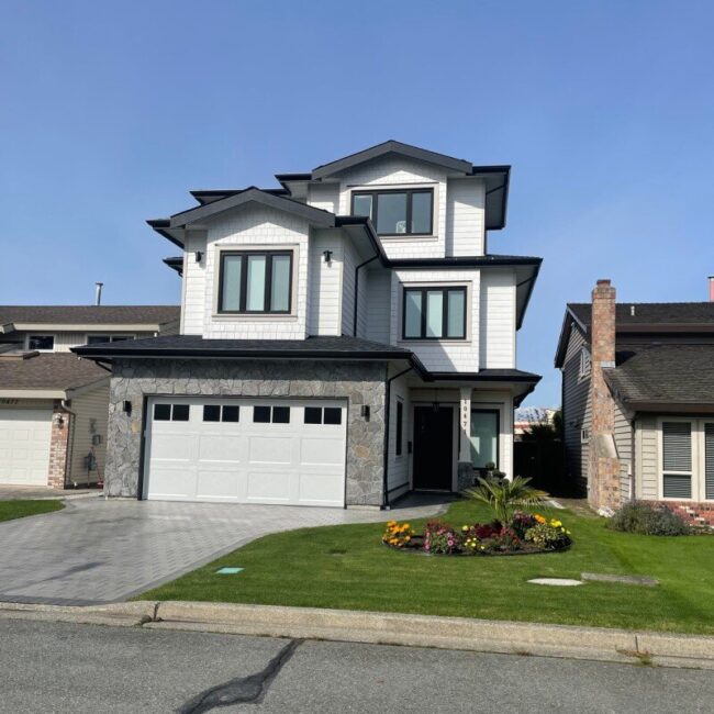
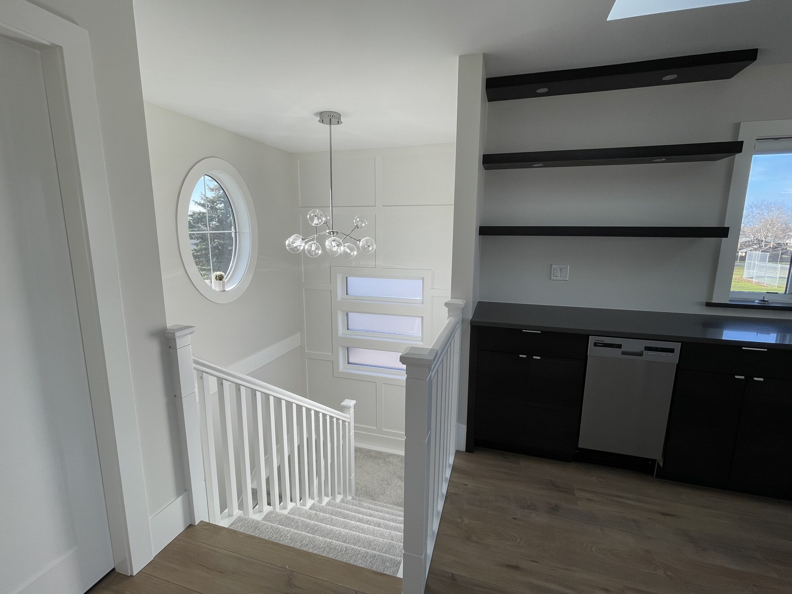
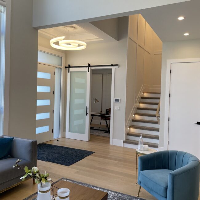
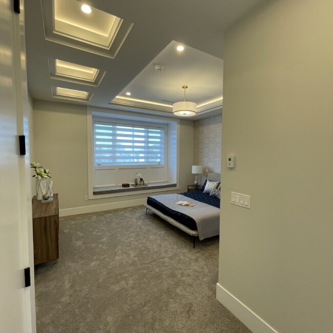
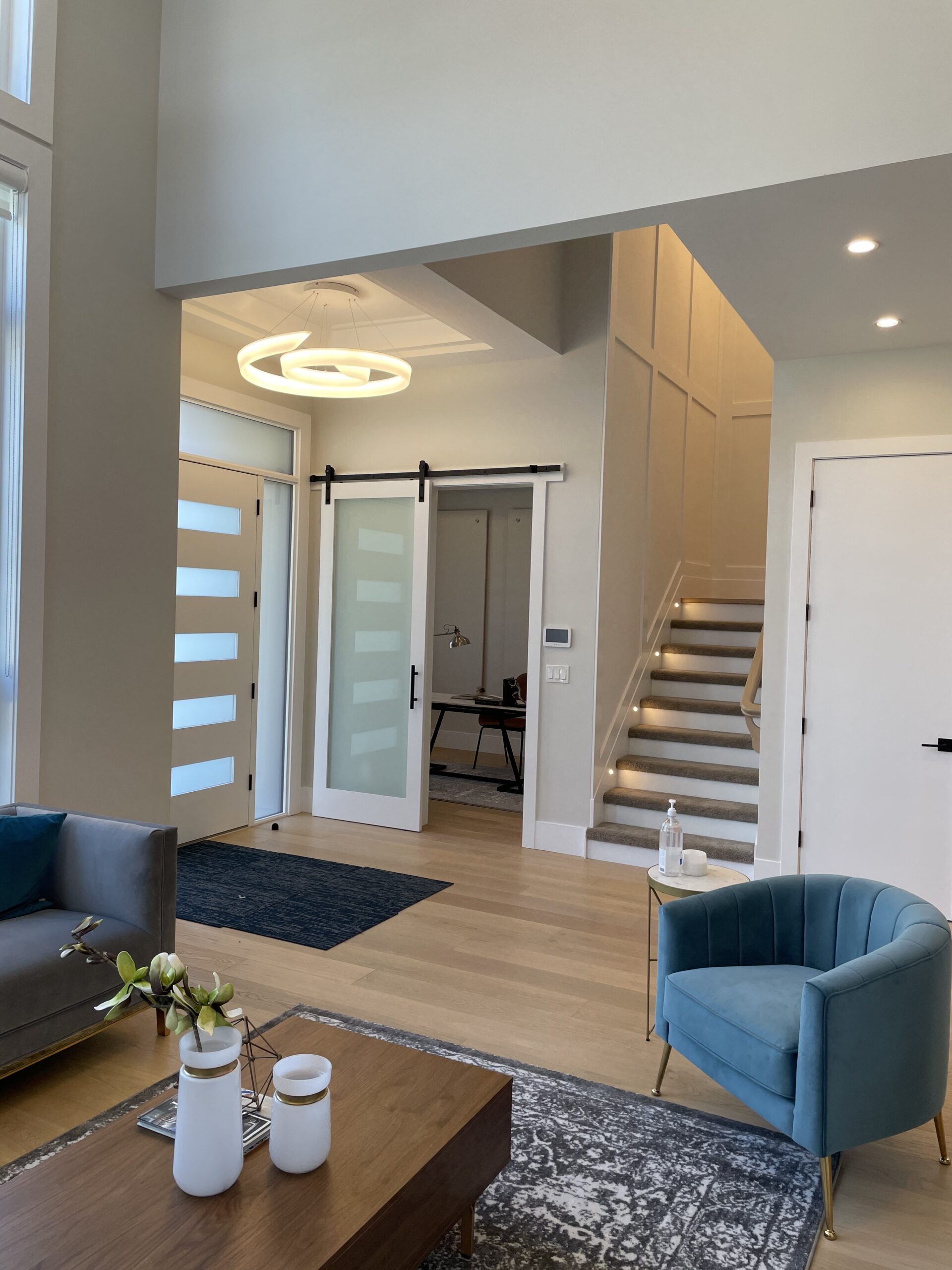
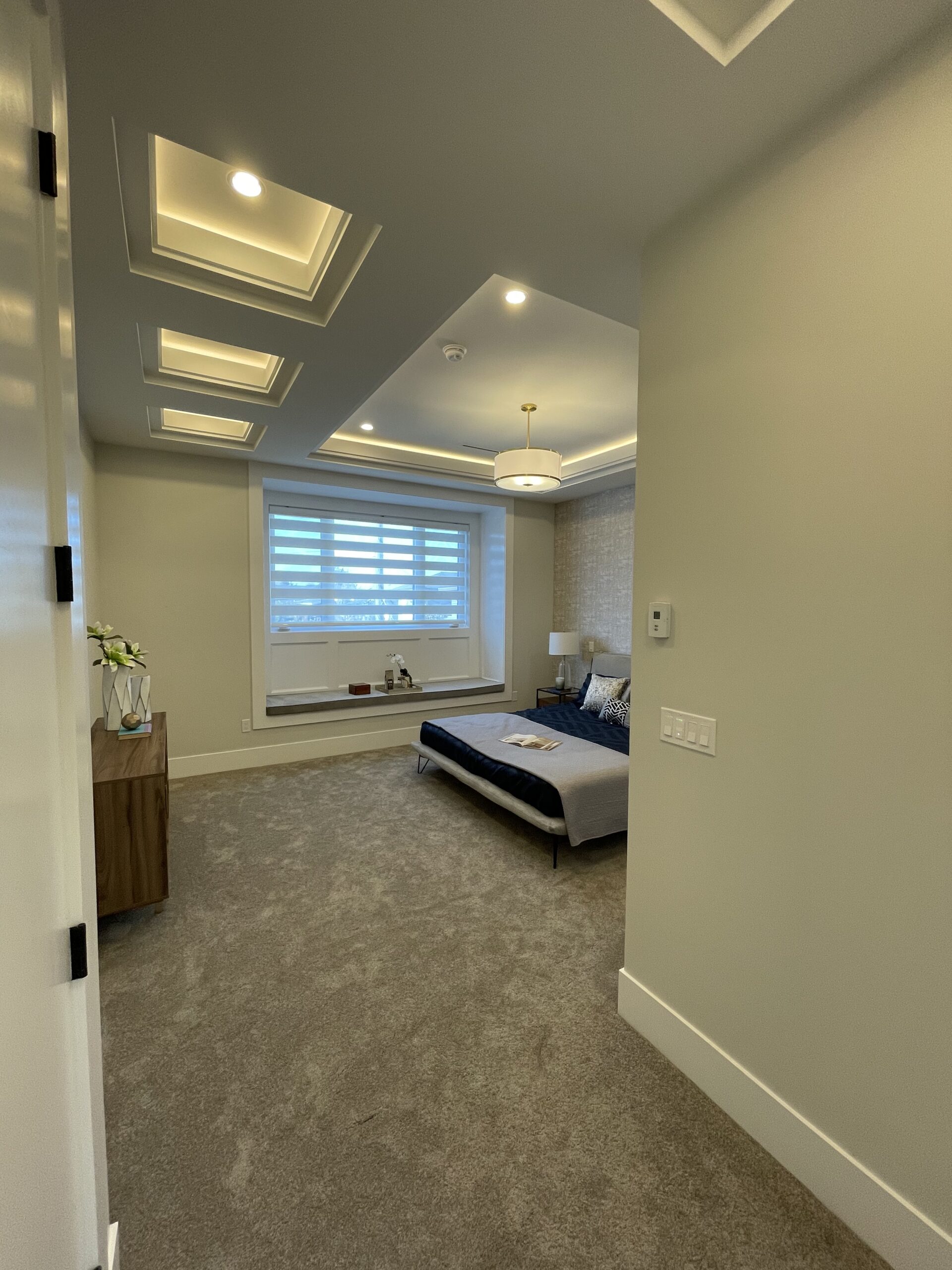
Nestled in a picturesque location, this custom-built, south-facing home offers breathtaking northern mountain views and direct access to a serene school yard. Designed with traditional elegance, the exterior features durable Hardie Plank siding and a striking stone finish on the garage. This three-story beauty showcases expert craftsmanship, particularly in the strategic placement of beams to support the structure. A unique design element in the main walkway is a lowered ceiling on the left, cleverly housing all essential services in one area, ensuring seamless functionality and aesthetic appeal. This home perfectly blends style, comfort, and thoughtful engineering.
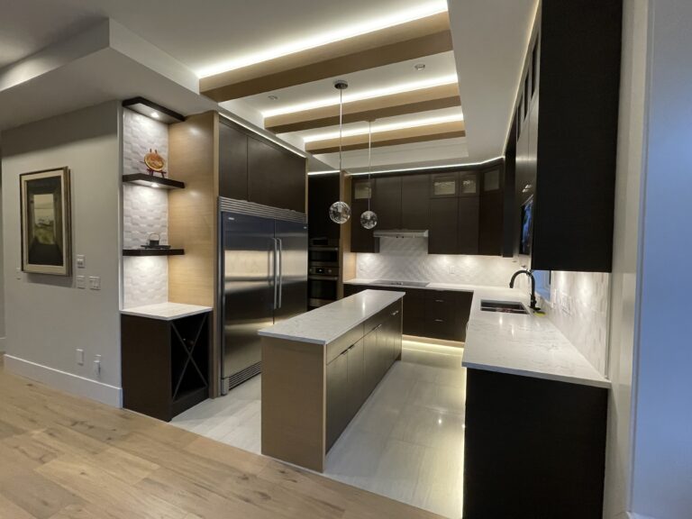
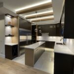
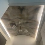
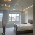
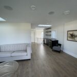
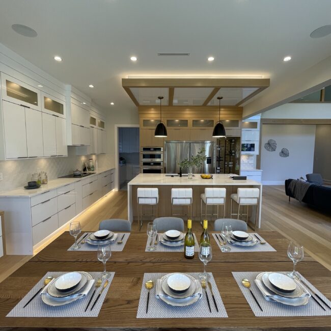
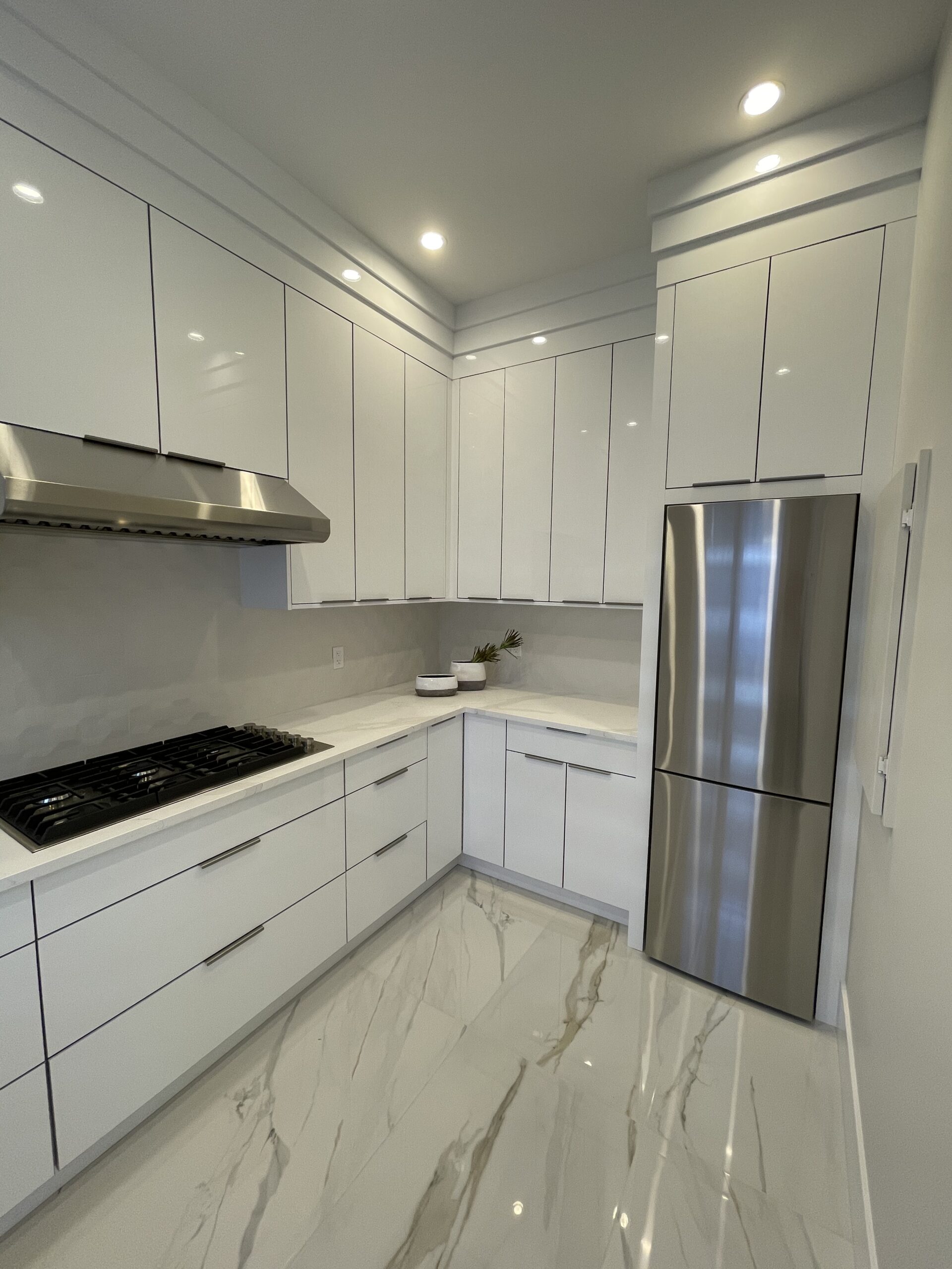
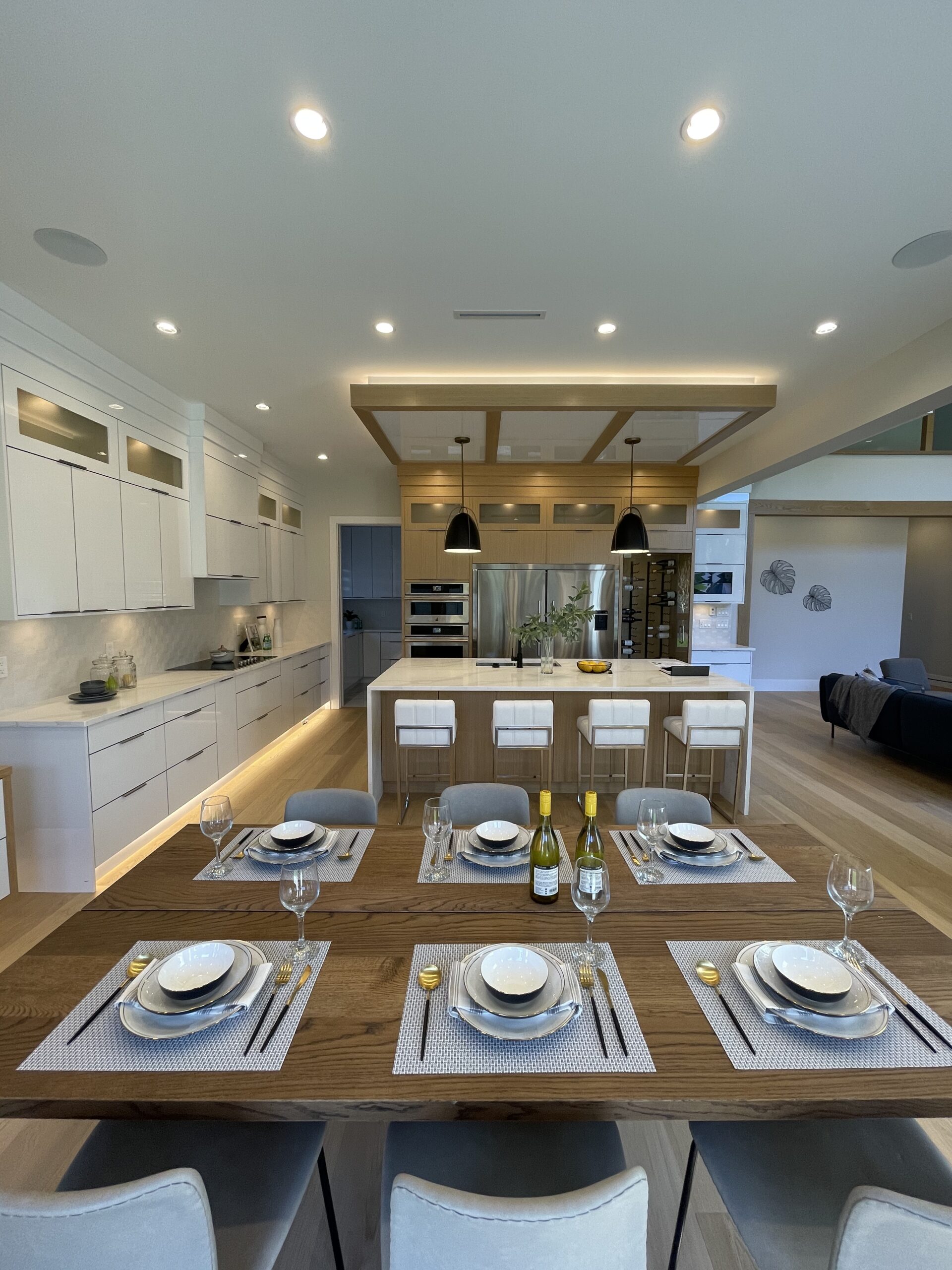
Compared to other homes where contractors don’t take the extra effort to hide an obtrusion, we find ways to blend it in with the design of the interior. Instead of stopping the ceiling box at the corner where it would meet the kitchen, we incorporated it throughout the perimeter of the kitchen. To add another design aesthetic to the kitchen we built three separate beams tied into the original drop ceiling around the perimeter giving the entire area a completed look. What started as an obtrusion to the interior design concluded with an enhancement to the overall main floor design.
Smart living
At vero eos et accusamus et iusto odio dignissi ducimus qui blan ditiis praesenti
ECO Construction
At vero eos et accusamus et iusto odio dignissi ducimus qui blan ditiis praesenti
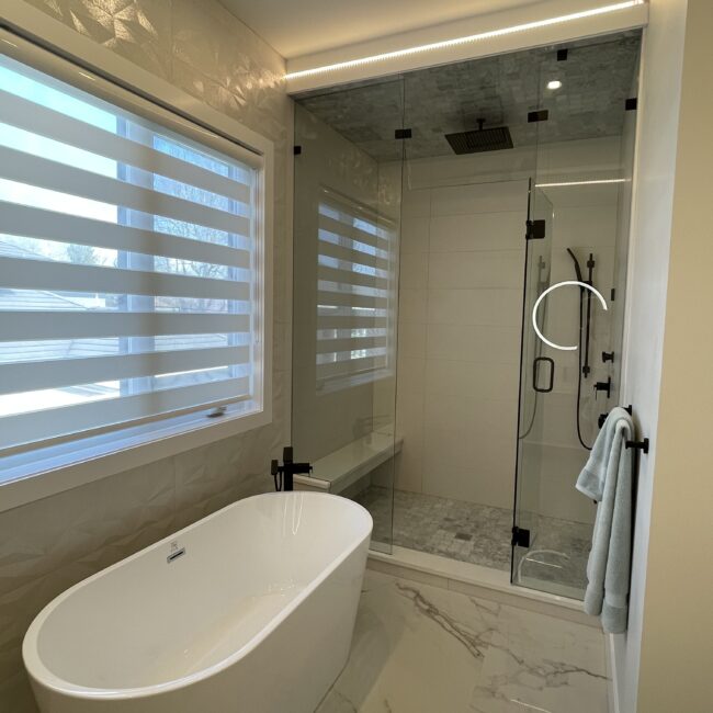
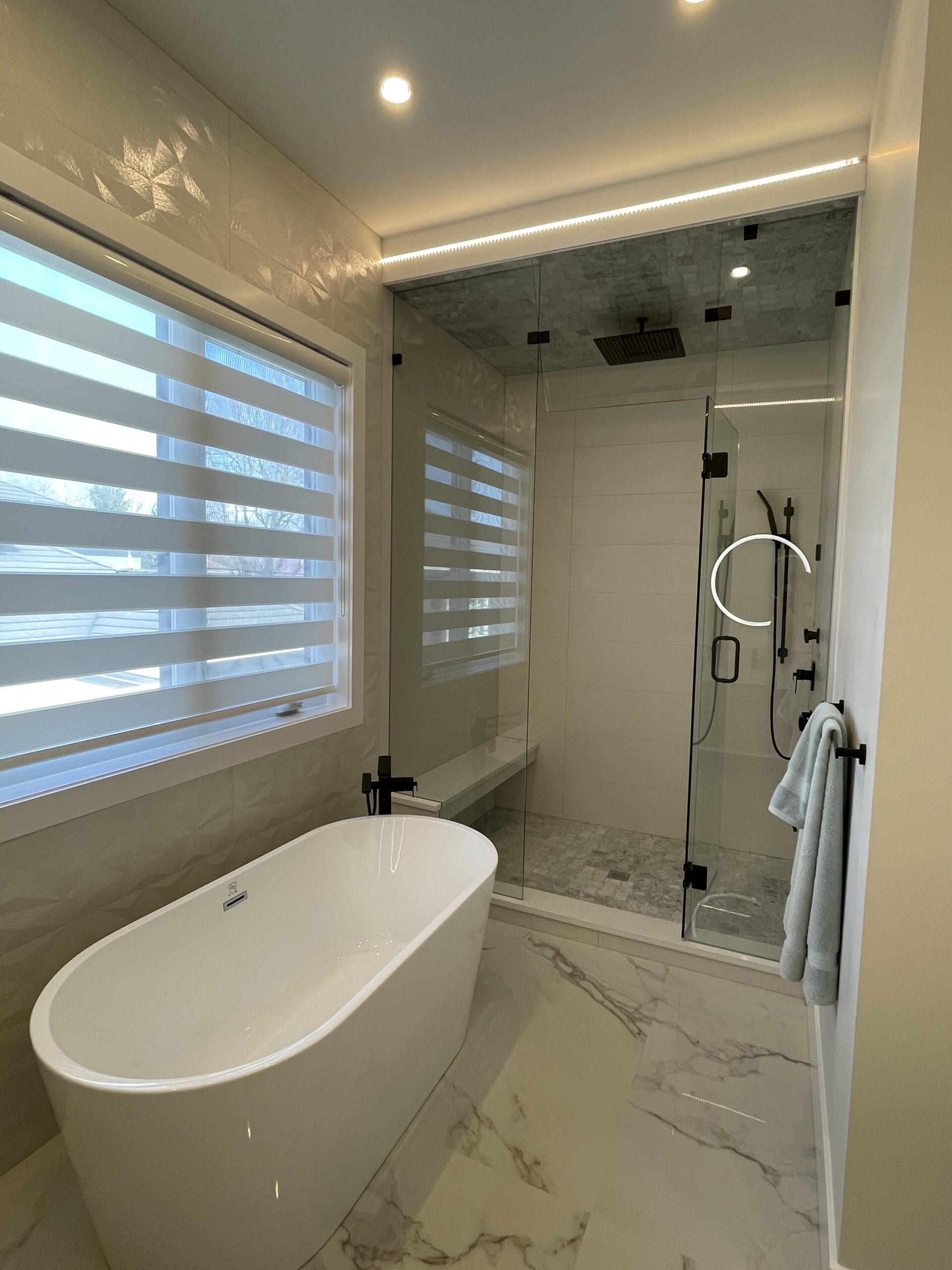
Window in bathroom
At vero eos et accusamus et iusto odio dignissi ducimus qui blan ditiis praesenti
Uniqueness
The space separating between two areas hallway and kitchen
Awesome Space
Added a huge bonus to the space, as well as an awesome design feature
Awarded design
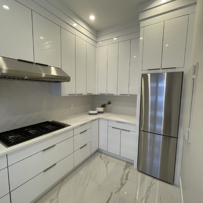
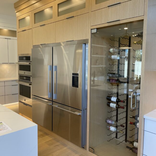
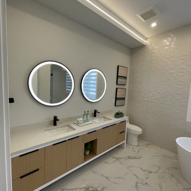
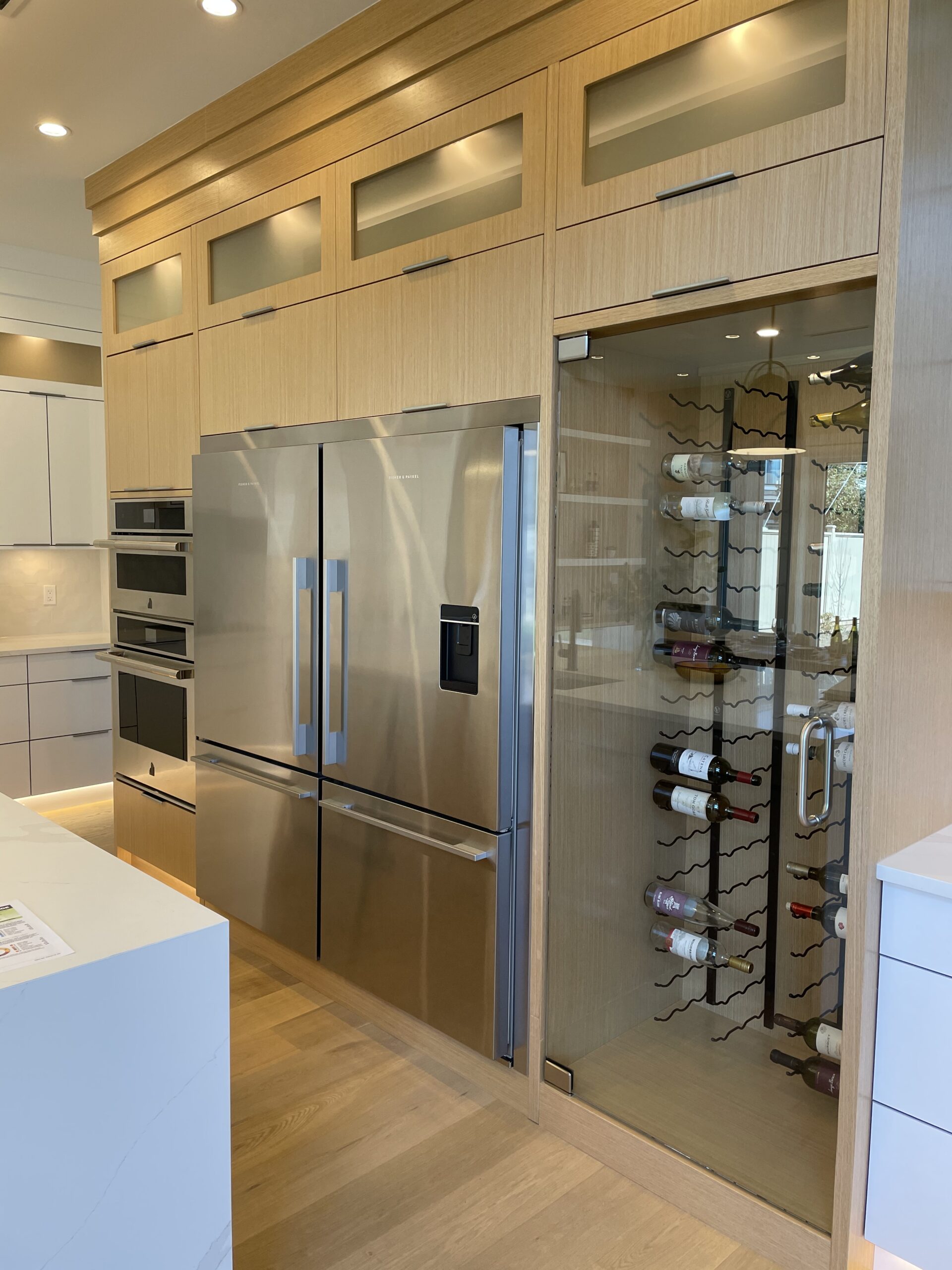
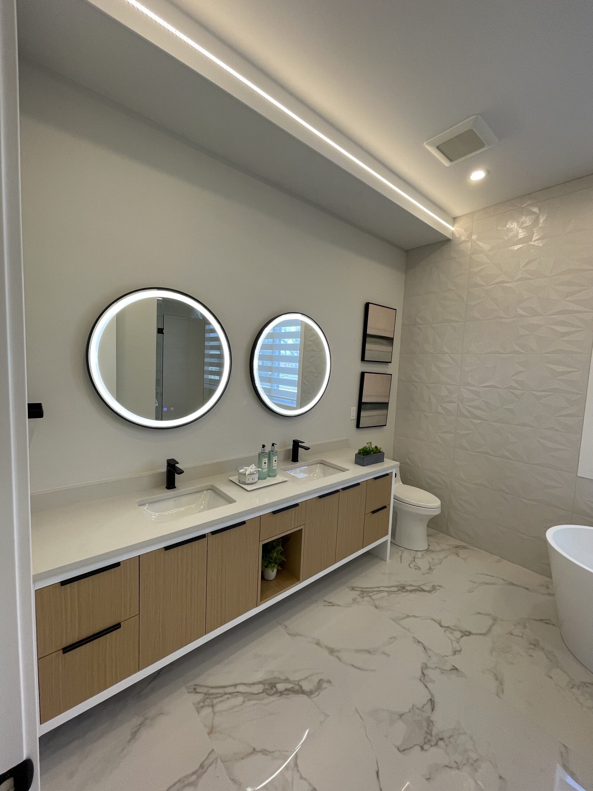
The design of the home utilized white acrylic and rift white oak.
Project Innovation
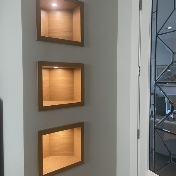
The Niches
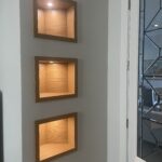
In the home office of this property you will notice a wall of niches. This was a feature that was added in as framing progressed when we saw we had a curved inner wall for the powder room andvoid space on the back side of the wall. That void allowed us to frame three separate vertical niches within the wall space which we finished by a box made from our kitchen cabinet installers using the same white oak material used throughout the house. This was another design aspect we chose to incorporate to further enhance the interior.Other contractors tend to leave areas like this as a plain canvas because it adds extra work or simply because it is “good enough.” At Plus Living we look for ways to enhance your future home.
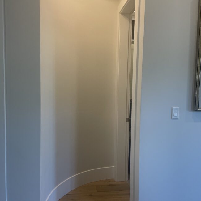
The curved wall
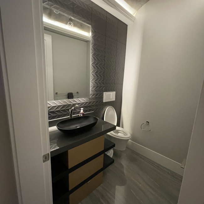
Powder Room
As the main property feature we envisioned something that would be a wow factor that very few other homes, if any, would have the same concept.
The idea came whilst touring the slab company and a sample of the Quartz was on display. After inquiring about the slab and learning about its translucent capabilities we knew this would be the perfect feature wall.
The design of the home utilized white acrylic and rift white oak. To tie things together we were able to source pure white oak planks to use for the arch.
As you can see in the photo, that overlooked detail by other builders which we sought to address has added a huge bonus to the space, as well as an awesome design feature.
schedule a visit
Home Design
Touch of perfection
Restaurants + _
At vero eos et accusamus et iusto odio dignissimos ducimus qui blan ditiis praesentium voluptatum deleniti atque corrupti quos dolores et quas molestias excepturi
School + _
At vero eos et accusamus et iusto odio dignissimos ducimus qui blan ditiis praesentium voluptatum deleniti atque corrupti quos dolores et quas molestias excepturi
Shopping Mall + _
At vero eos et accusamus et iusto odio dignissimos ducimus qui blan ditiis praesentium voluptatum deleniti atque corrupti quos dolores et quas molestias excepturi
Hospital + _
At vero eos et accusamus et iusto odio dignissimos ducimus qui blan ditiis praesentium voluptatum deleniti atque corrupti quos dolores et quas molestias excepturi
